
geofacets and tidyverse for geographic visualization
Kevin showed us how to use geofacets and other tools within tidyverse to plot COVID-19 and vaccination data organized by geographic entities.
if(!require(tidyverse)) install.packages("tidyverse"); theme_set(theme_light())
if(!require(geofacet)) install.packages("geofacet")
if(!require(zoo)) install.packages("zoo") # for calculating 7-day rolling means
if(!require(purrr)) install.packages("purrr") # for efficient for-looping
if(!require(sf)) install.packages("sf") # for mapping
if(!require(ggmap)) install.packages("ggmap") # for mapping
if(!require(maps)) install.packages("maps") # for mapping
if(!require(mapproj)) install.packages("mapproj") # for mapping
if(!require(countrycode)) install.packages("countrycode") # for converting to country codes
if(!require(scales)) install.packages("scales") # for pretty-looking scales
if(!require(wpp2019)) install.packages("wpp2019") # for population totals by country
if(!require(gridExtra)) install.packages("gridExtra") # for multi-plotting
## View names of each grid:
get_grid_names()
## Select target grid/country:
geo_grid = europe_countries_grid1 # aus_grid1 for Australian states
## Clean up country names to official names using countrycode:
geo_grid <- geo_grid %>%
mutate(name = countrycode(code, "iso2c", "country.name"))
######################
# Compile COVID data #
######################
## Extract cumulative confirmed, deaths, and recovered cases:
covid_cases <- c("confirmed", "deaths", "recovered") %>%
purrr::map(~paste0("https://raw.githubusercontent.com/CSSEGISandData/COVID-19/master/csse_covid_19_data/csse_covid_19_time_series/time_series_covid19_",
.x, "_global.csv") %>%
read.csv(file=., check.names=FALSE, stringsAsFactors=FALSE) %>%
rename("country" = `Country/Region`, "province" = `Province/State`) %>%
mutate(country = ifelse(country == "Bosnia and Herzegovina", "Bosnia & Herzegovina", country)) %>% # clean up B&H
# filter(country == Country) %>% # fill this in if only one country wanted
filter(province == "") %>% # comment off to examine province-level differences
select(-Lat, -Long) %>%
pivot_longer(-(1:2), names_to = "date", values_to = .x) %>%
mutate(date=format(as.Date(date, format='%m/%d/%y'),'%Y-%m-%d'))
) %>%
reduce(full_join, by = c("province", "country", "date")) %>% # reduce using a repeatedly-applied function
filter(country %in% geo_grid$name) %>%
mutate(code = countrycode(country, "country.name", "iso2c")) %>%
group_by(country) %>% # can also change to province/stats for single countries
mutate(
daily_confirmed = confirmed - lag(confirmed, default=0),
daily_deaths = deaths - lag(deaths, default=0),
daily_confirmed_7day = zoo::rollmean(daily_confirmed, k=7, fill=NA),
daily_deaths_7day = zoo::rollmean(daily_deaths, k=7, fill=NA)) %>%
ungroup()
## Combine global population totals with covid data:
data(pop)
covid_cases <- pop %>%
mutate(country = countrycode(country_code, "iso3n", "country.name", warn=F),
pop = `2020`*1000) %>%
filter(!is.na(country)) %>%
select(country, pop) %>%
right_join(covid_cases, by="country")
## Combine cumulative vaccinations (from Our World In Data) with covid data:
covid_cases <- read.csv("https://raw.githubusercontent.com/owid/covid-19-data/master/public/data/vaccinations/vaccinations.csv",
check.names=FALSE, stringsAsFactors=FALSE) %>%
mutate(country = countrycode(iso_code, "iso3c", "country.name", warn=F)) %>%
select(country, date, daily_vax_7day = daily_vaccinations, people_fully_vaccinated) %>%
left_join(covid_cases, ., by = c("country", "date"))
## Calculate per-capita covid measures, force all to be positive (>=0)
covid_cases <-
covid_cases %>%
mutate(across(starts_with("daily_"), ~(function(.)./pop)(.x), .names="pc_{.col}")) %>%
mutate(across(starts_with("pc_"), ~(function(.)ifelse(. >0, ., 0))(.x))) # uses anonymous functions
##################
# Map COVID data #
##################
## Create a simple map of Europe to plot:
eu_full <- sf::st_as_sf(maps::map("world", region = c(geo_grid$name, "Czech Republic"), plot=F, fill=T))
eu_full <- eu_full %>% mutate(country = ifelse(ID == "Czech Republic", "Czechia", ID)) # fix naming problem with Czech Republic
eu_cropped <- st_crop(eu_full, xmin = -13, xmax = 40, ymin = 34, ymax = 72)
ggplot(data=eu_cropped) +
geom_sf(fill="grey", color="white") +
coord_sf(crs = st_crs(4326)) + # 3347 is interesting to look at actual sizes
geom_sf_text(aes(label=country)) +
theme_void() +
theme(legend.position = "none")
## Get most recent rows of each country for vaccinations and covid stats:
cumul_covid <- covid_cases %>%
group_by(country) %>%
slice(which.max(as.Date(date))) %>%
select(country, code, confirmed, deaths)
cumul_vaccines <- covid_cases %>%
group_by(country) %>%
filter(!is.na(people_fully_vaccinated)) %>%
slice(which.max(as.Date(date))) %>%
select(country, people_fully_vaccinated)
## Combine most recent covid data into sf map object:
eu_map <- eu_cropped %>%
left_join(cumul_covid, by="country") %>%
left_join(cumul_vaccines, by="country")
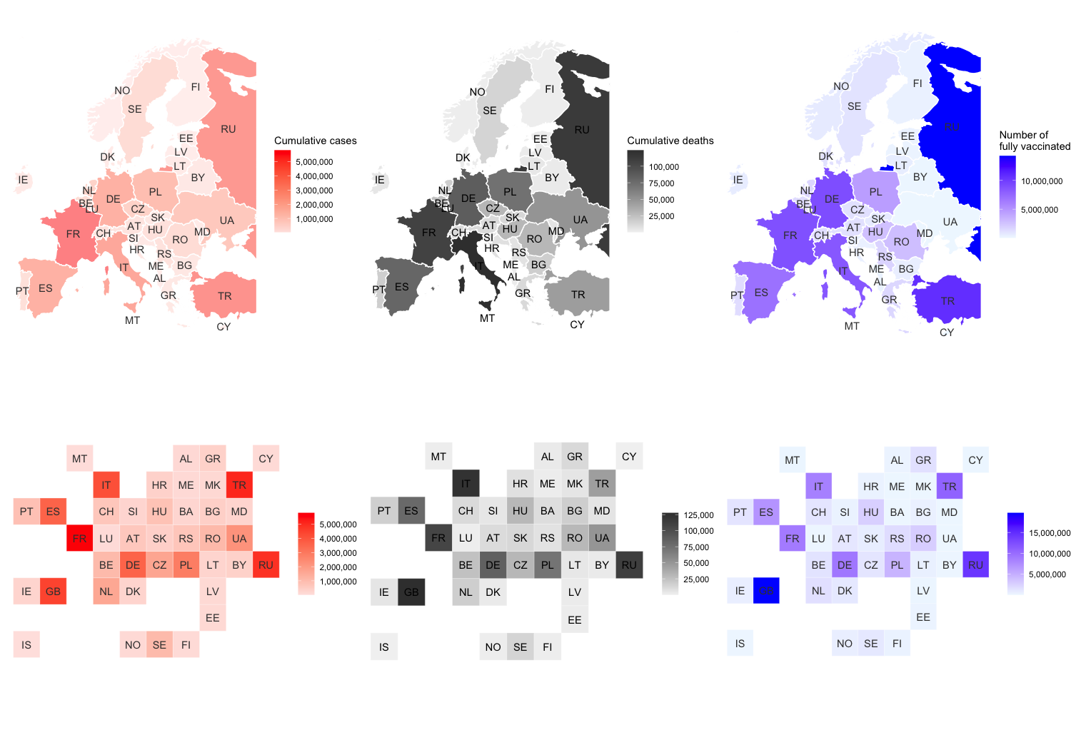
## Plot cases
(p1 <- ggplot(data=eu_map) +
theme_void() +
geom_sf(aes(fill=confirmed), alpha = 0.5, color="white") +
geom_sf_text(aes(label=code), color="grey24") +
scale_fill_gradient(low="mistyrose", high="red", labels=scales::label_comma()) +
labs(fill = "Cumulative cases"))
## Plot deaths
(p2 <- ggplot(data=eu_map) +
theme_void() +
geom_sf(aes(fill=deaths), color="white") +
geom_sf_text(aes(label=code), color="black") +
scale_fill_gradient(low="grey95", high="grey24", labels=scales::label_comma()) +
labs(fill="Cumulative deaths"))
## Plot vaccinations
(p3 <- ggplot(data=eu_map) +
theme_void() +
geom_sf(aes(fill=people_fully_vaccinated), color="white") +
geom_sf_text(aes(label=code), color="grey24") +
scale_fill_gradient(low="aliceblue", high="blue", labels=scales::label_comma()) +
labs(fill="Number of\nfully vaccinated"))
##########################################
# Tile map COVID data using the geo_grid #
##########################################
## Combine covid data into geo_grid for tiling:
geo_grid_data <- geo_grid %>%
rename(country = name) %>%
left_join(cumul_covid, by=c("country", "code")) %>%
left_join(cumul_vaccines, by="country")
## Plot cases:
(p4 <- geo_grid_data %>%
ggplot(aes(x = col, y = row, fill = confirmed)) +
theme_void() +
geom_tile(color = "white") +
scale_y_reverse() +
geom_text(aes(label = code), color="grey24") +
scale_fill_gradient(low="mistyrose", high="red", labels=scales::label_comma()) +
coord_equal() +
labs(fill=NULL))
## Plot deaths:
(p5 <- geo_grid_data %>%
ggplot(aes(x = col, y = row, fill = deaths)) +
theme_void() +
scale_y_reverse() +
geom_tile(color = "white") +
geom_text(aes(label = code), color="black") +
scale_fill_gradient(low="grey95", high="grey24", labels=scales::label_comma()) +
coord_equal() +
labs(fill=NULL))
## Plot vaccinations:
(p6 <- geo_grid_data %>%
ggplot(aes(x = col, y = row, fill = people_fully_vaccinated)) +
theme_void() +
scale_y_reverse() +
geom_tile(color = "white") +
geom_text(aes(label = code), color="grey24") +
scale_fill_gradient(low="aliceblue", high="blue", labels=scales::label_comma()) +
coord_equal() +
labs(fill=NULL))
## Plot all together (optional):
gridExtra::grid.arrange(p1, p2, p3, p4, p5, p6, nrow=2)
#####################################
# Plot a time series using geofacet #
#####################################
## First, make a target plot of a single country:
covid_cases %>%
filter(country== "France") %>%
ggplot(aes(x=as.Date(date), y = pc_daily_confirmed_7day*1e5)) +
coord_cartesian(ylim = c(0,100)) +
geom_ribbon(aes(ymax = pc_daily_confirmed_7day*1e5, ymin = 0), fill = "red", alpha = 0.5) +
geom_line(aes(y = pc_daily_vax_7day*1e4), color="blue") +
scale_y_continuous(sec.axis = sec_axis(~./10, name="Vaccinations per 1,000,000\n(7-day average)")) +
scale_x_date(breaks = scales::breaks_width("3 months"), labels = scales::label_date_short()) +
labs(x = NULL, y="Covid cases per 100,000\n(7-day average)") +
theme(strip.background = element_blank(),
strip.text = element_text(color="black"),
axis.title.y.right = element_text(color="blue"),
axis.text.y.right = element_text(color="blue"),
axis.title.y.left = element_text(color="red"),
axis.text.y.left = element_text(color="red"))
## Now add geo_facet to plot per-capita confirmed cases for all EU countries:
covid_cases %>%
ggplot(aes(x=as.Date(date), y = pc_daily_confirmed_7day*1e5)) +
coord_cartesian(ylim = c(0,100)) +
facet_geo(~ country, grid = geo_grid) +
geom_ribbon(aes(ymax = pc_daily_confirmed_7day*1e5, ymin = 0), fill = "red", alpha = 0.5) +
geom_line(aes(y = pc_daily_vax_7day*1e5/10), color="blue") +
scale_y_continuous(sec.axis = sec_axis(~./10, name="Vaccinations per 10,000\n(7-day average)")) +
scale_x_date(breaks = scales::breaks_width("6 months"), labels = scales::label_date_short()) + # also "%Y %b" good
labs(x = NULL, y="Covid cases per 100,000\n(7-day average)", title = "Per-capita COVID cases") +
theme(strip.background = element_blank(),
strip.text = element_text(color="black"),
axis.title.y.right = element_text(color="blue"),
axis.text.y.right = element_text(color="blue"),
axis.title.y.left = element_text(color="red"),
axis.text.y.left = element_text(color="red"),
plot.title = element_text(hjust=0.5))
## Per-capita deaths:
covid_cases %>%
ggplot(aes(x=as.Date(date), y = pc_daily_deaths_7day*1e6)) +
coord_cartesian(ylim = c(0,50)) +
facet_geo(~ country, grid = geo_grid) +
geom_ribbon(aes(ymax = pc_daily_deaths_7day*1e6, ymin = 0), fill = "black", alpha = 0.8) +
geom_line(aes(y = pc_daily_vax_7day*1e6/100), color="blue") +
scale_y_continuous(sec.axis = sec_axis(~./100, name="Vaccinations per 10,000\n(7-day average)")) +
scale_x_date(breaks = scales::breaks_width("6 months"), labels = scales::label_date_short()) + # also "%Y %b" good
labs(x = NULL, y="Covid deaths per 1,000,000\n(7-day average)", title = "Per-capita deaths due to COVID") +
theme(strip.background = element_blank(),
strip.text = element_text(color="black"),
axis.title.y.right = element_text(color="blue"),
axis.text.y.right = element_text(color="blue"),
axis.title.y.left = element_text(color="black"),
axis.text.y.left = element_text(color="black"),
plot.title = element_text(hjust=0.5))
## Bonus: design your own grid!
grid_design()
# e.g. reefs from: https://i.pinimg.com/originals/5b/91/32/5b913268a913d584d9c99cd8d7d95c12.gif
mygrid <- data.frame(
name = c("Turtle Group", "Lizard Island", "Cod Hole", "Ribbon Reefs", "Bougainville Reef", "Endeavor Reef", "St Crispin", "Open Reef", "Tongue Reef", "Holmes Reef", "Flora Reef", "Michaelmas Cay", "Upolu Cay", "Arlington Reef", "Outer Barrier Reef", "Herald Cay", "Howie Reef", "Dart Reef", "Otter Reef", "Herald's Surprise", "Flinders Reefs", "Taylor Reef", "Britomart Reef", "Trunk Reef", "Myrmidon Reef", "Orpheus Island", "Magnetic Island", "Middle Reef"),
code = c("Turtle Group", "Lizard Island", "Cod Hole", "Ribbon Reefs", "Bougainville Reef", "Endeavor Reef", "St Crispin", "Open Reef", "Tongue Reef", "Holmes Reef", "Flora Reef", "Michaelmas Cay", "Upolu Cay", "Arlington Reef", "Outer Barrier Reef", "Herald Cay", "Howie Reef", "Dart Reef", "Otter Reef", "Herald's Surprise", "Flinders Reefs", "Taylor Reef", "Britomart Reef", "Trunk Reef", "Myrmidon Reef", "Orpheus Island", "Magnetic Island", "Middle Reef"),
row = c(1, 1, 1, 1, 1, 1, 1, 2, 2, 2, 2, 2, 3, 2, 3, 3, 3, 4, 4, 5, 6, 7, 8, 9, 10, 11, 12, 13),
col = c(1, 2, 3, 4, 5, 6, 7, 1, 2, 3, 4, 5, 7, 7, 1, 2, 3, 7, 1, 8, 8, 8, 9, 9, 10, 11, 12, 13),
stringsAsFactors = FALSE
)
geofacet::grid_preview(mygrid)